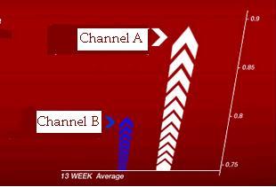
 The good part
The data is a 13 week average. Averages are always good. And this is a nice quaterly average.
Now,
The not-good part
1) This is ONE-DIMENSIONAL data
...but a SECOND DIMENSION is used (unfairly, in my opinion) to give a false sense of extra superiority. In other words, all relativism in the graph should lie on one axis ONLY since there is only a single variable (presumably TVR%) that is being studied.
But what's happenning on the X-axis?
See how the two bars are of different widths? Even right at the base. And the relative widths go on increasing as the X-axis values increase. So there is a correspondence between the X-axis values and the bar widths. But the data is supposed to be one-dimensional!
The lie-factor
Edward Tufte, the person who has probably contributed the most to the science and art of data visualization introduced a term called the lie factor in the 80s (?). It's the ratio of the 'size of graphic' to 'size of data'. if a lie-factor = 1, then the graph is true to the data. But that's not the case here.
It is interesting to calculate an approximate lie-factor here. Now given that the area of the two bars are not of a standard shape we make use of a 'Monte Carlo estimation' process. Simply put:
- We spray the graph with dots or throw darts at it like below (sorry for the bad quality).
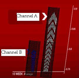 - Then just count the number of dots or darts in each bar of the above graph
- In this case, we want to compare areas, so we take a ratio of the number of dots
- Of course, this is an approximate estimation method. The approximation improves with greater dot density
So, what's the lie-factor?
- It turns out that the ratio of number of dots in the Channel A bar to Channel B bar is 5.5
- And the actual data? Judging this from the graph is made difficult since the axis is tilted. But looks like it's 0.89 and 0.8 for channel A and B respectively. This gives us a ratio of 1.11
- So the lie factor here is 5.5 divided by 1.11 = almost 5! (4.95)
In other words, the graph bloats the actual data effect by a factor of 5!
Assuming a one-one equivalence with the average human mind's perception and the lie-factor, a person would assume that Channel A's viewership is 5 times more than Channel B's while it is actually almost the same!
2) No axis label
The reader has to assume that the data is TVR% data and not, say, Reach% data. Or could it be channel share data? All three are metrics expressed in %s but are very different concepts having specific application in media strategy. For me, this graph is saying "Don't worry about what the numbers are. Just focus on the fact that we're number 1". It's almost taking the media literate reader for granted.
3) The axis itself
- Why are the axis non-orthogonal i.e why aren't the X and Y axis are not perpendicular to each other? They should be in this case. Are the axis tilted to highten (falsely) channel A's numerical superiority
- How does one read off the bars? If you draw a straight line parallel to the X-axis as you should, you 'll read it wrong with this tilt.
- What's with the Y-axis on the right. Not that it matters at all actually but just curious since the convention is to have it on the left.
- How does one read off the bars? If you draw a straight line parallel to the X-axis as you should, you 'll read it wrong with this tilt.
- What's with the Y-axis on the right. Not that it matters at all actually but just curious since the convention is to have it on the left.
4) Significance
Is the relative advantage in TV ratings even statistically or practically significant to talk about?5) Scale
Maybe you noticed that when we took the ratio of the actual numbers it came to 1.11 = saying that the numbers are almost the same! But starting the axis values (origin) at about(!) 0.75 rather than zero adds to the perception skew.....when i do the rescaling and other changes:
 The only decoration i have done is that HUGE greater-than sign. Is that also lying?
9 comments:
Sharma:
Shouldn't you be commenting these things on TV or news papers to get a greater reach? Greater reach is not for increasing your readership, but to educate more peole. I am asking this because, as of now, how many of those people who watched the original TV programme (or read original story) will read your blog?
BTW, I have a question in my blog on numeral system, to you.
Thanks for your comment SSK.
> Greater reach is not for increasing your readership, but to educate more peole
Actually, SSK, i am associated as a consultant to some players in the media industry in India. So that prevents me from doing any such exercise.
Also ,I do feel that knowledge has a way of finding itself reaching the right people. And with the net, this is enhanced all the more.
>i am associated as a consultant to some players in the media industry in India.
Whoa. Cool.
The biggest not-so-good-thing about the graph is, as you point out, significance. Is something better just because more people watch it or read it or listen to it, or is it great because of something intrinsic to the product itself? The focus of any ad should be the *content* of the channel, and not the *popularity*.
You're a statistician, right? How about a few posts now and then on "hard" (ie. math-y) statistics?
Hi Kshitij,
> The biggest not-so-good-thing about the graph is, as you point out, significance.
oops...my mistake for not making 'significance' clear. So here's what it is:
The data presented here is part of a survey. So what if we redid the survey and checked how many people saw Channel A and how many saw channel B? Most likely we'll get another answer. So the apparent difference in the viewership levels of the two channels could be pure chance! - this chance is because we chose to *sample* some people and could not afford to go to the full population i.e *Statistical* Significance.
> Is something better just because more people watch it or read it or listen to it, or is it great because of something intrinsic to the product itself? The focus of any ad should be the *content* of the channel, and not the *popularity*.
Nice one. So one way the TV industry operates is use Time Spent as a measure of 'content'. So 100 people in the universe and 5 walked in to the programme. That is called 'reach' - just a headcount. But a TV rating is a metric based on reach as well as how much time each of those people spent. (it involves weighting by time).
> You're a statistician, right? How about a few posts now and then on "hard" (ie. math-y) statistics?
ha..ha...two reasons why:
1) There is only so much of contribution you can make there (in blogging terms). A lot of that stuff is already there on the net or in textbooks.
2) I like to emphasize the intuitive approach and 'stats in your everyday life' approach. I am fed up of people hating stats. And a lot of that blame goes to us for not teaching it well. So i'd like to make stats simple and enjoyable for people.
Guess what, i have seen people complicating stuff purposely just so it seems they are intellectual! On the other hand, i'd go with Douglas Hofstadter and say we need to first do something urgently in removing 'innumeracy' and 'fear of numbers'. The rest will follow.
Ahhhh, *Statistical* significance. See what I mean about you doing some posts on stats? We're all pretty clueless here.
I guess,though, your approach is the right one, in blogging terms. But hey, you could do something like pick a random stats topic and break it down for us, or maybe -- ah -- spice it up with some personal story, like maybe how you became interested in stats. Think about it.
Ahhhh, *Statistical* significance. See what I mean about you doing some posts on stats? We're all pretty clueless here.
I guess, though, your approach is the right one, in blogging terms. But hey, you could do something like pick a random stats topic and break it down for us, or maybe -- ah -- spice it up with some personal story, like maybe how you became interested in stats. Think about it.
> you could do something like pick a random stats topic and break it down for us
Yes. Will do this. Let me think of some nice topics.
Sharan: Good Post.
As you would know, Edward Tufte would call those Arrow Heads, Chart Ducks...;)
(same goes to the big greater than symbol of your graph...;)
In Edward Tufte's cut it to the basics approach, all we would require is perhaps two dots, perhaps one above the other with a legend pointing to which one is for what channel...
But then, who will "watch" such a "dead" graph? Only you and me and Tufte of course...;)
Thanks Arunn.
Actually wonder if you really require a graph!
Post a Comment